Short version: if you enjoyed a post and don’t want to comment, click the Spiffy Button to let me know.
Feedback from people on the internet is hard; I can monitor hits and visits and bounces and loading times until the heat death of the universe and I still wouldn’t know whether the people visiting my site enjoy my content. Comments are often cited as a good indicator of blog interaction, some would say that a blog starts when its comments do, but especially with anime blogs (which I guess given the volume of content on the subject I’ve produced, mine falls into) comments tend to be about the subject (episode, series, movie etc.) rather than about what has been written. Just check out any well frequented anime blog (RandomC, The Cart Driver, Metanorn et. al.) for examples.
That’s not a negative, but it does favour popularity and quantity which could go some way to explaining episodic blog’s persistence - where better to discuss the latest episode than with other people in the same place? My content will never be popular or able to foster that kind of community, however the people that do read it - who I often talk to outside of this site - I know are often somewhat like me and favour silence. Sometimes you just don’t have anything to say which is why I’ve introduced The Spiffy Button to chaostangent.com.
It lives at the bottom of posts and is aimed at visitors who don’t want to comment but still want to let me know they enjoyed, thought about, agreed with or at least skimmed over what they read. It’s almost entirely anonymous, it doesn’t integrate with any social media malarkey and all it does is make a counter click up on my blog dashboard. It certainly isn’t a panacea for blog feedback, but it is another way to interact with a largely static site.
Background

If you haven’t ever visited Dustin Curtis’ site, then it’s unlikely you’ll have seen the “Kudos” button on each of his posts. It’s a fabulous bit of UI that, functionally at least, does exactly the same as my Spiffy Button. For a while at least it was executed almost identically as well. The act of hovering over an element seemed far more alluring than clicking on it; in practice though I couldn’t pull off the simplicity without wholesale ripping off the effect (see also OpenKudos).
With the idea still percolating, by accident (blame Tumblr) I came across a small sprite of Yoko from Gurren Lagann jumping with pixel-art glee. I figured I could do something with that animation - still keeping the hover interaction - but injecting something more than just a flat widget. This idea evolved into using a different character, specifically Makoto from BlazBlue who, true to this blog’s tag line, is more squirrel than sense.
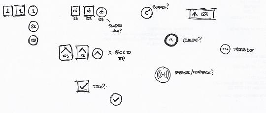
The prototype for this system almost went to production until I baulked at the last moment with regards an artworked UI element mixed in with otherwise simple ones. In short: it didn’t fit. I attempted a quick fix with the “ct” marque that I’ve used elsewhere but was largely demoralised from spending a not insignificant amount of time on a feature I was unhappy with. I eventually removed the visual code but left the other functional code in, mothballed for over five months. When I came back to it, the first thing I did was sketch out some possible style replacements for it.
After some quick prototyping, I gave up on the hover to interact idea and switched back to tried and tested clicks. Thus the version you see now was put in place.
Technically
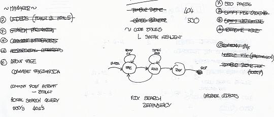
The initial, sprite based version of the kudos client side script used a pseudo state machine to animate between several different states. The initial “warm up” frames, the “hold” frame while a user held their mouse over the element, then the “success” frames that completed the animation. This was all rolled into a jQuery plugin and despite some fiddling in working out individual frame sizes on a sprite sheet, it for the most part worked.
The second version used CSS transitions to “spin” the logo and some JavaScript to work out when the transition had finished to trigger the relevant, element specific events. This allowed the CSS to control the “hold” length and not be passed or hardcoded into the script.


