First released: October 2012
Version reviewed: BluRay
The first scene of the first episode of K is an animated slideshow of cast names in English, each set with a different font. It’s definitely an odd way to start the series, given that as a fresh viewer, the names mean nothing, but the lingering sentiment is that, as with the clash of different fonts, this is a series that is fighting desperately for a personality of its own. There’s no question it has style, but rather than having too much of it, it has too many.
There’s the main story, for instance, of Yashiro Isana, a mysterious boy who has been framed for murder. Then there’s the other main story of Mikoto Suoh, the Red King, and his street gang battling against the Blue King, Reisi Munakata. Or the other main story about Kuroh Yatogami attempting to hunt down the Colourless King before he ascends to power, and the relationship he may have with the all powerful Silver King. There’s an awful lot going on but in spite of this, the series manages to be almost unceasingly boring.
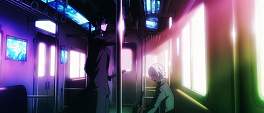
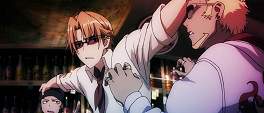
If all the talk of a super sentai squad of royalty makes it sound like a historical drama on the feuding between kings, that’s certainly something the writers of the series would encourage you to think; however it’s actually just a rabble of unlikable teenagers playing nobility. Setting the series an indeterminate time in the future (you can tell because of the fancy monorail and holographic cellphones) and attempting to add a layer of urban gang culture to the mix only compounds the issue. Durarara’s shadow looms large here, not helped by the blonde bartender looking uncannily like Shizuo and the naming clash between the Colourless King and the Colourless gang.
Infused with some reality bending magic and a dose of swordplay and the result feels like the writers did a Supermarket Sweep smash and grab for ideas when planning the series. It undoubtedly has a lot more creativity on display than many other series, but it seems eternally trapped building its world rather than getting on with telling a story within it. Yashiro’s story is bloated over the first two thirds of the runtime and is largely comprised of a glacially slow series of revelations about his past, interspersed with the nonsensical machinations of the Blue and Red kings who have so much homoerotic tension roiling between them it was surprising the Red King’s incarceration didn’t devolve into a raunchy shower scene.
By the time we’ve delved into the history the man Yashiro supposedly murdered, the history of a magical stone tablet stretching all the way back to World War 2 and a whole lot of inconsequential faffing about from various members of the different factions, it’s a relief when things actually start happening. Even if those things involve a sleek looking blimp - you know, the blimp that’s been flying all over the city, of course you know the one! - and a pants-on-head stupid invasion on the aforementioned island school. It’s not that events are hard to follow, only that it’s hard to care.
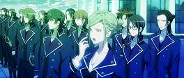
The core group of amnesiac Yashiro, swordsman Kuroh and permanently naked Neko lack any kind of chemistry and their staying together smacks of plot convenience. Similarly the Blue King and his buttoned up army of a do-gooders have perfected the insufferably boring “cool and aloof” approach to life, while the Red King’s minions at least show some emotion, even if that’s just obnoxiousness and directionless anger.
So you have a story trying to do too many things and cast members that engender not a bit of empathy, at least the visuals are on point right?
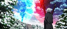
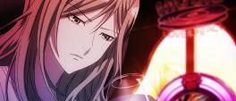
Let me start by saying that it would be unfair to pin any blame for the visuals on Studio GoHands when realistically my umbrage with the series’ aesthetic style lies wholly with director Shingo Suzuki who also had a hand in the Mardock Scramble films and 2013’s Copellion. There is a decent visual style to K, unfortunately it is plastered over by colour grading that a four year old with a supersoaker full of ink could make look better.
Like any technique, when used judiciously colour grading can add a lot to anime and live action alike; how it’s used here though smacks of the director attempting to brand a style and make a name for himself. The outcome though looks mildly horrific and I can almost hear the plaintive cries of the artists whose work has had the equivalent of coloured cellophane glued onto it.
This is to say nothing of the character designs themselves which, for the males, are excessively derivative and for the females - well, let’s just say that I wrote “reminds me of Tenjho Tenge” in my notes. Of the handful of female characters there are, several have the same proportions as a strand of spaghetti with a pair of brussel sprouts taped to them, and the other one is a taciturn goth loli who barely says four sentences. It’s sloppy and dull and, lamentably, matches the series’ sensibilities to a T.
It’s no mistake that when it first aired back in 2012, I steered clear of K. Not just because its name makes it almost impossible to search for, but because it didn’t offer a compelling reason to continue watching. That I picked it up again two years later has more to do with the recently released Missing Kings movie for which I was pencilled in to see at this year’s Scotland Loves Anime. The rest of the series though demonstrates a clutch of interesting concepts - the gargantuan Damocles swords, the lineage of kings etc. - but spends too long with boring or inconsequential characters, isolated on that island school without any input from the other coloured kings.
K is a series that with a barrage of small tweaks - an ensemble cast, tighter pacing, less world building - could have been immeasurably better than the yawn-inducing mediocrity it turned out to be. Maybe the movie, with the foundations now laid by the series, will be the story the concept deserves - the Tamako Market movie certainly proved that pivoting between releases is not only possible but beneficial. Instinct though says it will likely be more of the same. The same tepid slapstick humour, the same gormless characters, the same squint-inducing colouring. Not even angela’s opening could save this.



Maybe the movie will give us a better look at some of these issues, but I doubt they can do too much within the confines of a movie.
I also seem to remember reading somewhere that the light novels that this was adapted from were written by something like 7 different authors, which might explain its lack of focus. I'm kinda curious if the novels feel as disjointed, but I doubt there's a translation out there and even if there were, I don't have a high opinion of light novel translations.