
One of the sites I've been working on for almost a year now has gone live: National College for Leadership of Schools and Children's Services. Responsible for markup, styling and scripting, the site went through numerous visual and requirement changes before the current layout and design was settled upon.
The client had a very strict set of requirements regarding accessibility, usability and aesthetics, the site was a great challenge and it's brilliant to see it go live. With it now out in the wild, it's a good opportunity to examine just some of the notable aspects of the project.
Carousel

The site demonstrates the full version of the carousel that currently adorns chaostangent.com and includes the quick-jump menu and some other tweaks. The quick-jump logic took a while to hammer down - it would have been easy to implement a simple, one-directional system but it needed to be smarter and choose the shortest path (either backwards or forwards) to the desired item. Hiccups included dealing with negative numbers (e.g. if you're on item four and the target item is number one, the difference between them is negative three) raised the question of whether to normalise that difference to a positive number and work from there or use the negative status to hint at the directionality the carousel should take (short answer: normalise). As an example of the logic, assume the carousel has eight items, the default and current state is the first item and a visitor has just clicked on item four. First, the difference between the two is taken: target - current = 4 - 1 = 3, this is then normalised in case of a negative number. The carousel assumes it is going to travel forward (right) to reach the target item, but first it checks to see whether the difference is greater than half of the total carousel items (four), which in this case it isn't at which point it moves right. In code, this is:
var diff = (targetItem - this.currentItem);
var normalisedDiff = (diff < 0) ? (diff * -1) : diff;
var newDiff = diff;

if(normalisedDiff > Math.round(this.items / 2))
{
    newDiff = normalisedDiff - this.items;
    newDiff *= (diff < 0) ? -1 : 1;
}

if(newDiff > 0)
{
    this.moveRight(null, newDiff);
}
else
{
    this.moveLeft(null, (newDiff * -1));
}
Simple, but effective. The assumption of always moving right deals with the case when there would be an equal number of moves either right or left. The transition from one item to another is done step by step rather than as a smooth, no-break transition. The reason for this leads back to the looping nature of the carousel: due to the way the elements are sequenced when the carousel moves, it would require a great deal of pre-calculation to produce a smooth animation with no real benefit to usability. User testing showed the staged transition helped identify which item a user was on at any time. Again, the carousel (and all scripts examined henceforth) are not released under a permissive license due to being part of a commercial project so are subject to standard intellectual property and copyright laws.
Tooltips
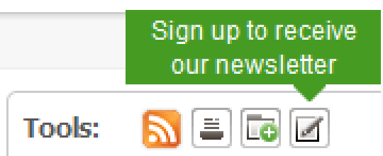
Another notable and suitably petite script concerns the tooltips for the "Tools" palette in the right column, the script for which I've named "Tooltipsy". The most vexing part of the script is keeping the tooltip within the viewport:
var co = liElem.cumulativeOffset();
var dim = liElem.getDimensions();
var ttDim = tooltipElem.getDimensions();
var vpDim = document.viewport.getDimensions();

var ttPos = {
  top: (co.top - ttDim.height - 11),
  left: Math.round((co.left + (dim.width / 2)) - (ttDim.width / 2))
};
var offset = ((ttPos.left + ttDim.width) > vpDim.width) ? (vpDim.width - (ttPos.left + ttDim.width)) : 0;

tooltipElem.setStyle({
  top: ttPos.top+"px",
  left: (ttPos.left + offset) +"px"
});

stemElem.setStyle({
  left: (Math.round(ttDim.width / 2) - 8 - offset)+"px"
});
This code is slightly out of context (the LI element's cumulative offset is calculated well before this segment) but the core of it is present. First the relevant dimensions and offsets are calculated, then an object is created with to store the estimated position of the tooltip - ignoring the viewport for the time being. The top constant (11) is has been hard-coded for speed, based upon the height of the tooltip plus a three pixel offset so the tooltip does not obscure the target content. The left position is calculated using the left cumulative offset plus half the width of the LI element, minus half the width of the tooltip - this should centre the tooltip according to the LI element. Next an offset is calculated for the viewport: if the tooltip is positioned beyond the viewport dimensions it is offset back so that it is entirely contained i.e. a horizontal scroll bar does not appear. Note that this offset only takes into account the right case, the left, top and bottom cases are ignored - a shortcut as the position of the tooltips is already known in this case, top and bottom cases would need the ability to display the tips above and below the element rather than just above as is the case here. After the tooltip is positioned, the stem "pointer" element is placed taking into account the offset so that it is always centred on the element being pointed to rather than the tooltip. The result is a stout little script just over seventy five lines long. If you're making your own tooltip script rather than using an publicly available library, one aspect which can be vexing is the geometry calculations: the tooltip must be visible for these to be correct, having the tooltips set as "display: none" means the dimensions will be zero or subtly incorrect.
Tabs
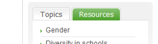
The tab system which is used all over the site was a particularly tricky bit of scripting and markup to get right. Accessibility to non-JavaScript users was a must, there were however other constraints: remain visible at larger text sizes and flow onto two or more lines if the tabs don't fit within the available horizontal space. The former is relatively easy to satisfy with larger background images for the CSS Sliding Doors technique; the latter not so much. At first blush, one would imagine floating the tabs to the left would do the trick, however this causes havoc with multiple lines and multiple words within the tab; the solution is to use "display: inline-block" for browsers which support it (IE8, Firefox 3+, Opera, Safari) and to use "display: inline" for IE6 and IE7. This means that Firefox 2 users (of which there is enough to warrant concern) are out of luck as FF2 does not support inline-block and there is no way of targeting that browser version over FF3. Thankfully the user statistics for the site meant this was an acceptable compromise but the bottom line is that there is no fire-and-forget way of styling robust tabs. Regardless, using inline and inline-block means the tabs are solid and cross-browser compatible and able to be used in different contexts throughout the site.
The markup shows some slight redundancy with a superfluous and mildly solecistic SPAN element, however this is necessary for the background effect which, in a difficult twist, needs to overlay the keyline when a tab is selected.
<ul class="tabList scripted">
  <li class="anonymous_element_3 on"><span>Topics</span></li>
  <li class="anonymous_element_5"><span>Resources</span></li>
</ul>
.tabList li {
  display: inline-block;
  background: url(tab-off-left.png) no-repeat left top;
  margin: 0 3px 1px 0;
  position: relative;
  cursor: pointer;
}

.tabList li.on {
  color: #FFF;
  background: url(tab-on-left.png) no-repeat left top;
  margin-bottom: 0;
}

.tabList li span {
  display: block;
  background: url(tab-off-right.png) no-repeat right top;
  padding: 0.3em 1em 0.2em;
}

.tabList li.on span {
  background: url(tab-on-right.png) no-repeat right top;
  padding-bottom: 0.27em; /* Most of the tab effect is about tweaking this value */
}
The UL.tablist element is pre-built by the tab script (called "Tabulator") based on the tabs that the script is fed. The "class="anonymous_element_3"" is generated by the script based upon a tab's ID. In this case, while the background images are separate, it would be possible to combine them into a single image to reduce HTTP request and loading time - however you would need to wrap your head around CSS sprites as well as some transparency tomfoolery. The IE6 and IE7 specific style sheets perform some minor alterations to this styling:
.tabList li { display: inline; }
.tabList li.on span { padding-top: 0.35em; padding-bottom: 0.24em; }
If you're unconcerned about using pixel values for padding then the numbers become easier to fathom and tweak.
The Tabulator script is short at just over 50 lines and doesn't do anything wildly inventive. Most of the selection logic is done using Prototype niceties like passing the element ID (automatically generated by Prototype if not explicitly set) of the tab to be selected to the event handler function. This could also be done by counting the number of previous siblings a tab in the tab listing has and selecting the tab content element based on that - potentially using CSS3 selectors such as nth-child; with Prototype 1.6.1 it would even be possible to store the element ID alongside the element with their DOM-less storage system.
Markup
The markup was always going to be complex: a large number of templates and a high degree of fidelity with the designs. Targeting the uncompromising XHTML 1.0 Strict doctype, the result is highly semantic and a tour-de-force of cross-browser compatibility. I tended to steer clear of "modern" CSS niceties which I've used in more recent projects such as direct descendant selectors (element1 > element2) which makes rounded corners easier with two nested DIV elements but means the markup needs to be completely respecified in an IE6 stylesheet; I did use :first-child in places but the need for IE6 class specifiers mooted their usage somewhat.
As the project spanned a number of months and a wealth of additions and amends, a strict logging system was put in place to deal with changes that were being made to the templates on a weekly basis. Whenever a release was made to the client, a full report on the files modified, removed or added and the impact of the changes was necessary, mostly these took shape according to requests which had been sent through which meant changes could be isolated according to their context. The project wasn't placed under source control until late - too late to be of much use - which is when the wonderful WinMerge comes into its own, even better that it is released free of charge.
Part of the release was an Online Visual Toolkit: essentially a collection of templates, components and best practice notes for usage of the templates and ancillary files. This acted as the main resource for demonstrating changes and providing updates and has been integrated into the launch of the site for all parties which are involved with working on the site.
Overall
Despite the length of the project, the result is a benchmark for design, usability and accessibility, catering to a wide audience without compromising aesthetics. There are elements of the site which haven't been examined in detail above (use of Cufon as a font display library, social bookmarking script to name but a couple) but they can be counted as minor notes to the major ones above. At the time of writing the site is currently going through some initial teething troubles: despite the templates originally validating against XHTML 1.0 Strict, the current pages do not for a variety of reasons - many to do with the templates being integrated with a bespoke content management system; currently the number of assets being loaded per page is quite immense especially with regards JavaScript source files and CSS backgrounds, even my developer note recommending the usage of a script combiner + compressor and the Google AJAX libraries has gone unheeded. Combine these with the slightly souring note that other JS libraries have been used instead of the ones available (Fabtabulous vs. Tabulator) and the launch isn't everything I had hoped, but the core of the project remains and with polish and incremental improvement, the situation will no doubt improve.