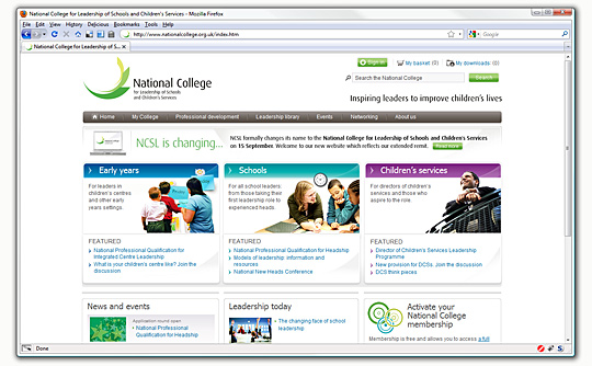
One of the sites I've been working on for almost a year now has gone live: National College for Leadership of Schools and Children's Services. Responsible for markup, styling and scripting, the site went through numerous visual and requirement changes before the current layout and design was settled upon.
a benchmark for design, usability and accessibility, catering to a wide audience without compromising aesthetics
Starting in November 2008 with the then named NCSL (National College for School Leadership), the number of templates could be counted on two hands and script components were non-existent; since then the brand and colour scheme have changed, a font replacement library has been implemented, upgraded then changed (
sIFR version two, then three, then
Cufon), script components now include tabs, social bookmarking, tooltips and a fully-featured carousel, and the number of templates has ballooned to encompass a wide variety of pages including a number of
member-only pages most site visitors will never see.
The client had a very strict set of requirements regarding accessibility, usability and aesthetics, the site was a great challenge and it's brilliant to see it go live. With it now out in the wild, it's a good opportunity to examine just some of the notable aspects of the project.
Read the rest of this entry

The newest addition to chaostangent.com is the carousel nestling comfortably at the foot of every page. Sporting a variety of "social media" feeds as well as other morsels, it showcases a number of interesting technologies and techniques including: a fully looping carousel (JavaScript and CSS), integration with numerous external APIs (PHP, Zend Framework), screen-scraping and local caching of results to name but a few. It successfully fulfils the primary goal I had for it: cramming as much functionality into a contained a space as reasonably possible.
I can just boot up Zend_Service_Delicious and be done with it right? If only things were that simple.
JavaScript
The carousel interface is design du-jour at the moment - sported by sites such as Apple, BBC iPlayer and Gametrailers - they manage selective display of information while still providing a high degree of interactivity. In short: they're swish and solve the problem of too much to feature in too little space. The carousel library I am using is a simplified, stripped-down version of one I developed for a large work project - for this reason I'm unable to release it under any kind of license. The original has a number of features that I wouldn't be using including automated construction of a "jump to" control and being able to navigate over a number of entries at once. My library is the only one I know of which successfully loops, providing an "infinite" carousel of sorts; other publicly available libraries cease at either end of the carousel which in some situations is more intuitive but the challenge of making one not do this was posed to me, and I couldn't very well pass it up.
Read the rest of this entry

