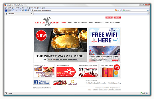
The longest running and most high-profile website I have the pleasure of working on is for Little Chef. With such a recognisable brand and in a period of increased company activity, the site is increasing its role as the primary communication with customers. With a recent aesthetic refresh which only select parts of the site were quick to follow, the remainder was still stoically in the old style - updating the rest was a deceptively large task and exposed the opportunity to rectify some of the niggling obstructions that had grown with the site. What on the surface was just a visual update was in a fact a more far-reaching upgrade.
if these were the most complicated aspects of the site the rebuild would have been simpler and drastically more straightforward.
Rebuilding an existing site always starts with the best intentions - glassy eyed optimism seeing only improvements and never pitfalls, but experience has taught temperance rather than ambitious extravagance. Ambivalence is quick to set in: on the one hand there is a full and detailed specification available in the form of the currently used site, while on the other it soon becomes rapidly apparent that with history comes refinement that may not lend itself to rapid reconstruction. Striking a balance between reconstructing for improvement and the silent threat of feature creep is the key to a timely and successful project.
Read the rest of this entry

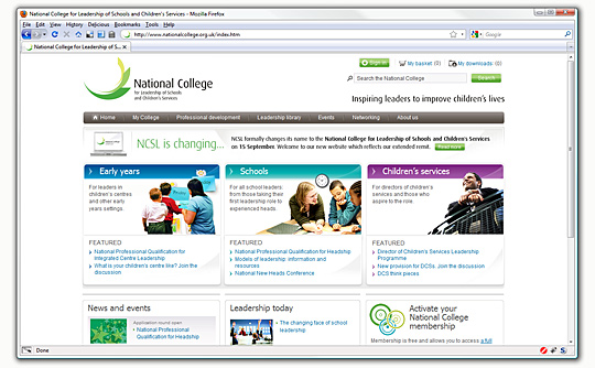
One of the sites I've been working on for almost a year now has gone live: National College for Leadership of Schools and Children's Services. Responsible for markup, styling and scripting, the site went through numerous visual and requirement changes before the current layout and design was settled upon.
a benchmark for design, usability and accessibility, catering to a wide audience without compromising aesthetics
Starting in November 2008 with the then named NCSL (National College for School Leadership), the number of templates could be counted on two hands and script components were non-existent; since then the brand and colour scheme have changed, a font replacement library has been implemented, upgraded then changed (
sIFR version two, then three, then
Cufon), script components now include tabs, social bookmarking, tooltips and a fully-featured carousel, and the number of templates has ballooned to encompass a wide variety of pages including a number of
member-only pages most site visitors will never see.
The client had a very strict set of requirements regarding accessibility, usability and aesthetics, the site was a great challenge and it's brilliant to see it go live. With it now out in the wild, it's a good opportunity to examine just some of the notable aspects of the project.
Read the rest of this entry

